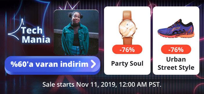
Tech Mania
AliExpress, Alibaba
A monthly e-commerce promotion for Tech lovers to explore hidden gems

As the lead product designer and production manager, I found an opportunity for a monthly promotion, Tech Mania, and refined its design, which led to a 37% increase in sales.
About
Mania is a monthly e-commerce promotion targeting small and medium-sized enterprises on AliExpress, an overseas product of Alibaba. It offers products to 150+ million international online buyers in 18 languages across the web and app platforms.
Time
April, 2021 (3 weeks)
My Role
Took the lead as the Sr. Product Designer and Design Manager
The Results
01 37% increase in sale
02 High-quality mass design production accomplished in 3 weeks
03 The design strategy was applied to another promotion, Home Mania

*Final templates for the auto mass production. Default texts are used within the images as placeholders.

The Context
The stagnant performance of “Super Tech Sales”
Tech Mania, previously called 'Super Tech Sales', is a monthly promotion for Chinese SMEs (small and medium-sized enterprises) on the AliExpress platform. As the Senior Product Designer, when reviewing the data, the following three problems captured my attention and motivated me to initiate the refinement.
01 Stagnant sales
02 Average performance on the AliExpress platform
03 Slight drop in the conversion rate
Investigation
The Research Goal
During the research phase, my objective encompassed assessing our current status, identifying opportunities for improvement, and shaping our refinement goals and approach based on the insights from the research. Here are the key takeaways from each round.
01 Stakeholder Interviews
1. Business PM | Rich experience in China e-commerce
|“Super Tech Sale" is grounded in the proven success of Taobao.
2. Content Designer | Rich experience for western brands
|“Super Tech Sale" fails to resonate with western shoppers.
So,
Is the proven success in the local market effectively adapted to the Western market?
02 User research
1. Business partners | Small & mid-size enterprises in China
|Contradictory naming: less "Super" brands, that offer limited discounts during the "Sale" event.
In comparison to giants like Xiaomi and Huawei on AliExpree platform, our business partners, small and mid-size enterprises in China, lacked the "Super" status and were unable to offer significant discounts.
2. The customers | Western shoppers
Overall brand image
A Doubtful, Messy Asian Market

*"Ongoing sales with doubtable prices, as messy as small Asian markets." (2020 AliExpress annual report)
Key User Impressions
Unreliable Brand Image With Poor UX Experience.
01 Unnoticeable
“Sales everywhere (in the app). Hardly noticed this one in the app.”
03 Unorganized
“Can’t find what I want. It feels like shopping in a messy Asian market.”
02 Unattractive
“Not attractive. It looks like a cheap Asian market.”
04 Inconsistent
“ (The pages) don’t look like in the same event. It's kind of confusing.”
02 Platform Audit
1. Competitors | Peers on AliExpress
|Diminished Presence: 'Super Tech Sales' amidst a platform overflowing with 'Super' and famous sales.
Business
Amidst numerous promotions and events bearing the family name "Super," such as Super Deals, and Super Brand Day, our own event failed to stand out on the AliExpress platform. Compounded by the platform's association with well-known sales like Double 11, and Black Friday, it proved challenging for our promotion to garner attention.
Branding (Visual)
The "Super Tech Sale" lacked a memorable visual style that could help it stand out among its peers.

*Examples of peer events on AliExpress.
Conclusion
The "Super Tech Sales" model maximized our limitations and minimized our advantages.
The Challenge
Given our current limitations, how can we strategically address challenges and improve our situation on the platform?
The Goals
01 Differentiate ourselves from peer events on the platform
02 Improve our brand image and user experience.
The Approach
01 Define our unique value to reposition the promotion
02 Refine our design with the new strategy
Research On Target Audience
Key Findings | 21- 32 years old Western Shoppers
Our target audiences, 21- 32 years old Western Shoppers, are willing to pay more for unique products they are interested in. E-commerce events with themed scenarios are more attractive to them.
Our Problems
Less famous high-quality products
Messy categories
Limited discounts
Our Advantages
Selected treasure products
Rich categories
Reasonable prices
Opportunities
01 Higher tolerance in prices and brands
02 More interested in themed scenarios and unique products
The Solution
|How about creating a space for tech lovers to explore our unique products?

Design Process
Design Goals
We aimed to enhance the user experience by creating an engaging space for tech lovers to explore tech gems adaptable to 18 language scenarios within the platform's technical constraints.
01 Mass Production Templates
Adaptable to 18 languages
Feasible within “platform frames”
02 UX & Art Direction
Engaging visual style
Consistent user experience
Iteration Overview
Initial wireframes
Below are parts of the initial wireframes based on feedback from stakeholder reviews. However, further testing is still needed to verify the adaptability and efficiency of the design.

Testing Goals
01 Evaluate the adaptability of templates to 15 language scenarios.
02 Assess the efficiency of key page structures in driving business.
The Approach
Accessibility Testing
Major layouts in 15 language scenarios
A/B Testing
Page structures and component patterns

*A/B Testing example: We wanted to explore the optimal banner heights and component patterns to structure major pages
Results & Iterations
01 Accessibility Testing
The Result
Overall, the initial design demonstrated poor adaptability to 15 language scenarios. Specifically, it was incompatible with extensive content requirements, such as external materials for marketing. Moreover, it lacks of adaptability to right-aligned language scenarios, such as Arabic.

The Iteration
In collaboration with stakeholders, I collected our requirements across various channels, pages, and language scenarios. I then categorized these needs and devised two types of alignments with four sets of templates, taking into account our engineering capacity.

02 A/B Testing
The Result
Overall, the result pointed to our proposed versions. Some key takeaways are listed below:
01 Flexible component heights allow better customization and adaptability to different page content.
02 Feature-based structures perform better as they highligh our business strategy for each page
03 Multiple access points at the Entrance drive more traffic and facilitate easy exploration of specific sections.
The Implication
Here are two examples of how I implemented these takeaways.


*(Left) Ordinary promotion entrance on AliExpress (Right) Tech Mania


*Examples of three pages. Default texts are used within the images as placeholders.

*Examples of different product cards
Reflections
01 Accessibility In Mass Production
In this project, some designs generated by the mass production system were not accessible. Since I couldn't oversee all the visuals in an event, it's essential to make sure the system and designing templates produce accessibility-friendly assets. If given more time, I would communicate more with developers to optimize the templates.
02 Efficiency In Multi-culture Collaborations
Since the business covers diverse markets, many of my stakeholders are from different regions. Besides, stakeholders have their vendor teams. Time differences across regional teams, the remote working model, and the complex team structure exposed more difficulties to this fast-paced e-commerce project. Efficiency in multi-culture collaboration is something I'd like to discuss further with my stakeholders.
More Challenges Behind The Screen
01 Art Direction
How to crafting an engaging space for Tech Mania?
1. Visual Design
Creating an engaging context rather than a sale banner
| Theme + Message +Scenario
*Example: Event Entrance
(Left) Ordinary promotion entrance on AliExpress (Right) Tech ManiaRight
Example: Components for different types of products
(Left) Top brands (Mid) Selected gems (Right) Unique features
2. Motion Design
Enhancing a sense of space with animations
| Hierarchy, Rhythm, Time & Size
Hierarchy | Business needs
What do we want to highlight within audiences' limited attention to our entrance? Event logo + call-to-action > Products > background image.
Rhythm |Visual communication
How should I show our space to our audiences? The depth, Z space, then the scale, X space.
Time & Size|Technical constraints
How long should I craft this motion story and what kind of animation should I use to make sure the file size works within technical constraints?
*Default text for testing
03 Mass Production Templates
Here are some examples of how I designed templates for the mass production system adaptable to 18 language scenarios, efficient within “platform frames” meanwhile considering budget and business needs.
1. Adaptable to 18 languages
| Space

*Example from a recent promotion on AliExpress
| Alignment
In some cultures, characters are aligned on the right. This kind of layout requires two templates.

*Example from a recent promotion on AliExpress
| Height
But aligned in the middle does not solve all the problems. Sometimes it requires more height, which is more precious.

*Example from a recent promotion on AliExpress
· My Solution ·
According to the business needs and the product features, customize the alignment and the height of top visuals for different pages.
Example: Key visuals for different pages (*Default text)
(Left) Highlighting brands (Mid) Highlighting products (Right) Highlighting the event
2. Efficient within “platform frames”
On AliExpress, different components have different functions, for instance, format, time, and whether they can be linked to detail pages. My designs should play their roles within the constraints and maximize the features.
Here is an example of Splash Ad.
| Splash Ad ·
Splash Ad is a 3-secnd full-screen ad that appears on AliExpress at launch. It is not clickable or accessible to a product's detail page on AliExpress.

Example: Two Previous Versions (*Default text)
(Left) Too many messages for 3 seconds
(Right) Trying to highlight top products, but it cannot access product pages
· My Solution ·
According to the business needs and the product features, customize the alignment and the height of top visuals for different pages.

Keep the message clear and simple, meanwhile introducing the context, and indicating product categories.
About Production Management
Mentoring Fellow Designers
All the fellow designers were from our remote vendor team. Typically, Sr. designers and the vendor team have limited conversations (mainly by texting in the system). To help the team grow and deliver agreeable designs, I tried the following ways.
01 More tutorials
Besides traditional design style guides, I also provided more guidance to help my vendor team grow. For instance, tutorials via zoom, instructions, and tips in design files.
02 More conversations with team members
Paying attention to each designer. Instead of merely typing feedback in the system, I tried to build more conversations with team members via quick video calls, to understand their problems and provide advice accordingly.